This is a companion piece to our Best Cities for Work 2026 rankings, which you can find here.
The Best Cities for Work index ranks US metropolitan areas on what makes a place good for workers. It scores 40 metrics grouped into six pillars. The headline ranking is computed for 228 of the 233 US metro areas with populations above 200,000 (5 metros had data limitations that prevented scoring). Each metric is transformed where appropriate, winsorized at the 1st/99th percentiles, and converted to a z-score across that universe, with the sign flipped for “lower-is-better” metrics so that a higher score always means a better worker outcome.
Metric z-scores are averaged within each pillar; pillar scores are then themselves standardized and combined using the theory-justified pillar weights below. Missing metrics are handled by dropping and re-weighting the metrics that are present. If a metric had more than one-third of the data missing within a pillar, the pillar was dropped and the MSA was not scored in the final rankings (this impacted just 5 metros). For each scored component, this document lists its public label, its source-attributed technical name, a plain-language description, and a link to its underlying data source.
The public data source or appropriate Indeed data product for every data point utilized are linked below. Most of the data are publicly available, with a few notable exceptions. The Indeed Tightness Index and the AI Exposure Metric are proprietary Indeed Hiring Lab metrics. Glassdoor employee review ratings are from a proprietary metro-level extract; source links point to the relevant sections of the Glassdoor Economic Research blog. Adjusted wage metrics combine an underlying wage source with TAXSIM (income taxes) and Regional Price Parities (cost of living) data from the National Bureau of Economic Research and US Bureau of Economic Analysis, respectively. All US Census Bureau American Community Survey data are from the 5-year ACS (2020-2024).
Pillar and within-pillar weights are provided below.
Weighting at a glance
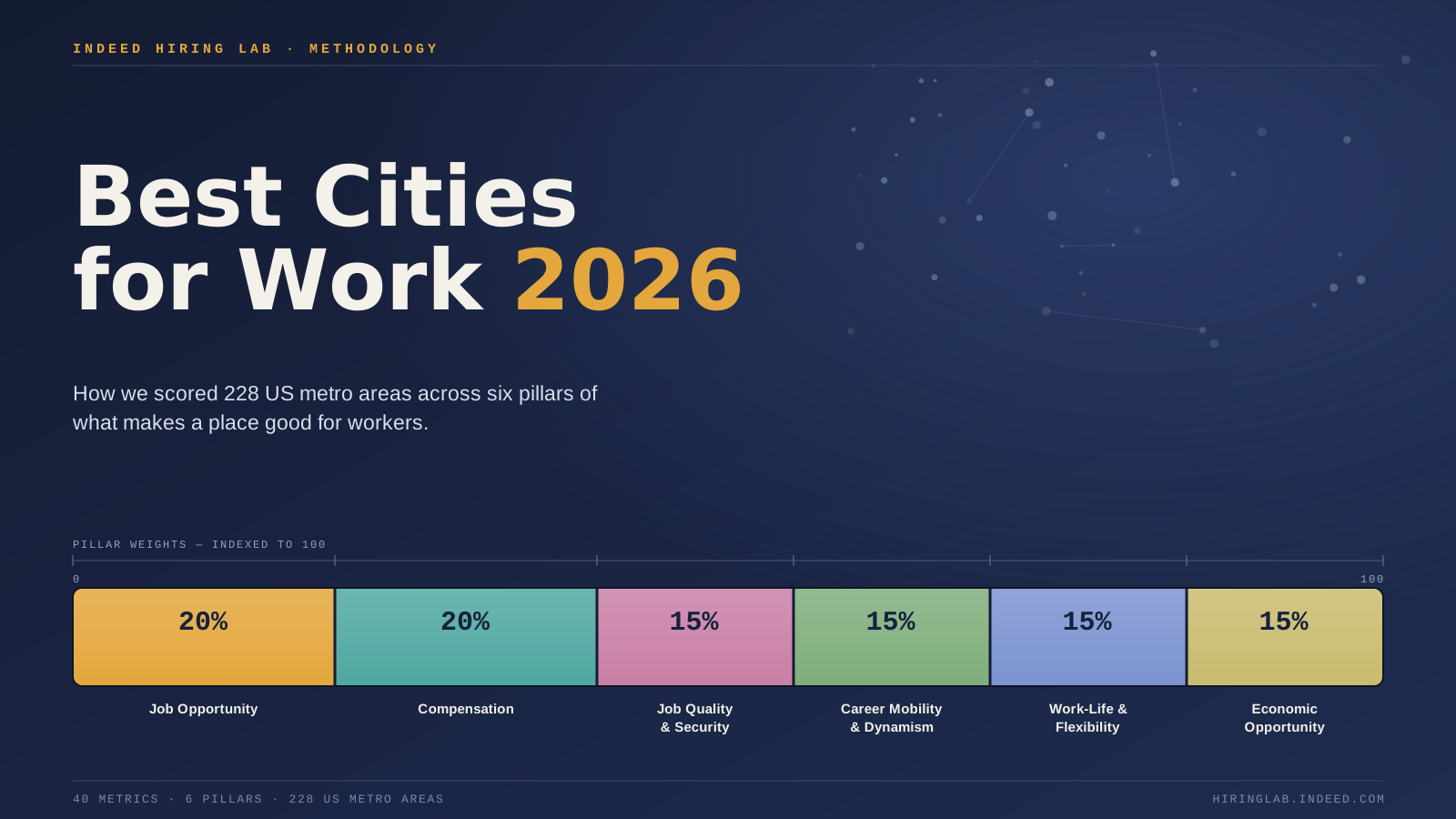
Headline pillar weights are theory-justified (20/20/15/15/15/15), applied to standardized pillar scores. Within each pillar, metrics are equal-weighted, with one exception: Pillar 1 uses custom weights that emphasize labor-market tightness.
| Pillar | Headline weight | Within-pillar weighting |
|---|---|---|
| Pillar 1 — Job Opportunity | 20% | Custom: See details in Pillar 1 section below |
| Pillar 2 — Compensation | 20% | Equal (25% × 4) |
| Pillar 3 — Job Quality & Security | 15% | Equal (≈14.3% × 7) |
| Pillar 4 — Career Mobility & Dynamism | 15% | Equal (≈14.3% × 7) |
| Pillar 5 — Work-Life & Flexibility | 15% | Equal (≈9.1% × 11) |
| Pillar 6 — Economic Opportunity | 15% | Equal (20% × 5) |
Equal-weight and other weighting schemes are published as robustness/sensitivity views alongside the headline.
Pillar 1 — Job Opportunity (20%)
Core question: Can workers actually find a job?
Measures the availability of work and the ease of matching to it — the volume of hiring demand, how tight the labor market is for job seekers, and how fully the prime-age population is employed.
Within-pillar weighting: Custom within-pillar weights (the only non-equal pillar), reflecting search-and-matching theory: Labor-market tightness is weighted most heavily (30%) as the variable most directly determining a job seeker’s job-finding rate. A metro’s unemployment rate and prime-age employment-to-population ratios have a weighting of 20%. All other Pillar 1 metrics are weighted at 10%.
| Metric | What it measures | Data source |
|---|---|---|
| Job posting growth, past year Job Postings Index, year-over-year percent change (Indeed Hiring Lab) | Year-over-year percent change in job-posting volume, measured as a rolling average of monthly year-over-year readings over the trailing quarter to smooth month-to-month noise. Source: Indeed Hiring Lab Job Postings Index. Higher = faster posting growth. | Indeed Hiring Lab — Job Postings Index |
| Job postings per 1,000 residents Job postings per 1,000 residents (Indeed Hiring Lab) | Volume of active job postings in the metro, averaged over a 30-day window (May 1–30, 2026) and scaled per 1,000 residents. Source: Indeed Hiring Lab posting counts. Higher = more openings relative to population size. | Indeed Hiring Lab — Job Postings Index |
| Job postings vs. pre-pandemic Job Postings Index level vs. February 2020 (Indeed Hiring Lab) | Current job-posting volume relative to the February 2020 pre-pandemic baseline (index = 100), averaged over May 1–30, 2026. Source: Indeed Hiring Lab Job Postings Index. Higher = posting activity further above pre-pandemic levels. | Indeed Hiring Lab — Job Postings Index |
| Labor market tightness index Indeed Tightness Index (Indeed Hiring Lab) | Composite measure of how tight the local labor market is, built entirely from Indeed engagement data: job-seeker volume, clicks and applications per posting, employer-paid effort (day-weighted sponsored share), and occupation/employer concentration. Contains no unemployment input. Source: Indeed Hiring Lab. Higher = tighter market, more favorable to workers. | Indeed Hiring Lab — Labor Market Tightness Index |
| Prime-age employment rate (25–54) Prime-age (25–54) employment-to-population ratio (Census ACS) | Share of the 25–54 population that is employed — a cleaner gauge of labor-market health than the unemployment rate, because it also captures people who have stopped looking for work. Source: US Census Bureau, American Community Survey. Higher is better. | US Census Bureau — ACS |
| Unemployment rate Unemployment rate, 12-month average (BLS Local Area Unemployment Statistics) | Share of the labor force that is unemployed, smoothed over the trailing 12 months to remove seasonal noise. Source: BLS Local Area Unemployment Statistics (LAUS). Lower is better. | BLS LAUS |
Pillar 2 — Compensation (20%)
Core question: Do workers earn enough to build a good life?
Captures both the level and the trajectory of pay, adjusted for what a paycheck actually buys locally. Real-wage levels are net of federal, FICA, and state/local income taxes and deflated by regional prices; wage levels are log-transformed to reflect the diminishing marginal utility of income.
Within-pillar weighting: Equal weight across the 4 scored metrics (25% each).
| Metric | What it measures | Data source |
|---|---|---|
| Posted median wage (cost-of-living adj.) Posted median wage, adjusted for taxes and cost of living (Indeed Hiring Lab; NBER TAXSIM; BEA Regional Price Parities) | Median advertised wage in job postings, converted to real take-home value: net of federal + FICA + state/local income tax, then deflated by regional prices. Uses a 30-day posting window, empirically shrunk toward a stable 365-day estimate for metros with thin posting volume, and log-transformed before scoring. Sources: Indeed Hiring Lab (advertised wages), NBER TAXSIM (taxes), BEA Regional Price Parities (cost of living). Higher is better. | Indeed Hiring Lab — Wage Tracker; NBER TAXSIM; BEA Regional Price Parities |
| Posted-wage growth, past year Posted-wage growth, year-over-year (Indeed Hiring Lab Wage Tracker) | Year-over-year growth in advertised wages, composition-controlled and measured as a trailing-quarter (3-month) rolling average of monthly year-over-year readings. Source: Indeed Hiring Lab Wage Tracker. Higher is better. | Indeed Hiring Lab — Wage Tracker |
| Reported median wage (cost-of-living adj.) Reported median wage, adjusted for taxes and cost of living (BLS OEWS; NBER TAXSIM; BEA Regional Price Parities) | Median wage across all occupations for people who work in the metro, converted to real take-home value: net of federal + FICA + state/local income tax, then deflated by regional prices, and log-transformed before scoring. Sources: BLS Occupational Employment and Wage Statistics (OEWS), NBER TAXSIM, BEA Regional Price Parities. Higher is better. | BLS OEWS; NBER TAXSIM; BEA Regional Price Parities |
| Share of jobs paying ≥ $25/hr Share of job postings advertising ≥ $25/hour (Indeed Hiring Lab Wage Tracker) | Share of local job postings advertising at least $25/hour, over a 30-day window — a wage-floor measure of access to solidly-paid work. Source: Indeed Hiring Lab Wage Tracker. Higher is better. | Indeed Hiring Lab — Wage Tracker |
Pillar 3 — Job Quality & Security (15%)
Core question: Are jobs stable, and do they come with meaningful benefits?
Combines job stability (separation risk, industry diversification, exposure to AI-driven displacement) with access to benefits and healthcare, plus the strength of legal worker protections.
Within-pillar weighting: Equal weight across the 7 scored metrics (≈14.3% each).
| Metric | What it measures | Data source |
|---|---|---|
| AI Exposure Metric AI exposure of the metro’s occupation mix (Indeed Hiring Lab) | How exposed the metro’s occupation mix is to displacement from generative AI, computed as a shift-share of Indeed’s occupation-level AI-exposure scores weighted by the local job-posting mix over the full May 1–30, 2026 window. Source: Indeed Hiring Lab (AI at Work). Lower exposure is treated as better. | Indeed Hiring Lab — AI Exposure Metric |
| Diversity of local industries Industry diversification, 1 less HHI across NAICS supersectors (BLS QCEW) | How spread across industries local employment is, measured as 1 minus a Herfindahl-Hirschman concentration index over NAICS supersectors — a guard against single-industry or one-company-town risk. Source: BLS Quarterly Census of Employment and Wages (QCEW), 2024. Higher = more diversified. | BLS QCEW |
| Employee benefits rating Employee benefits rating (Glassdoor) | Average employee rating of benefits at local employers, from Glassdoor reviews, aggregated by metro. Source: Glassdoor. Higher is better. | Glassdoor — Writing a benefits review |
| Primary-care doctors per 100k Primary care physicians per 100,000 population (County Health Rankings) | Supply of primary-care physicians per 100,000 residents, a proxy for access to healthcare. Source: County Health Rankings (analytic supplement, 2026). Higher is better. | County Health Rankings & Roadmaps |
| Uninsured rate (ages 19–64) Uninsured rate, ages 19–64 (Census ACS) | Share of working-age adults (19–64) without health insurance. Source: US Census Bureau, American Community Survey. Lower is better. | US Census Bureau — ACS |
| Worker legal protections Worker legal protections (Oxfam Best States to Work Index) | Strength of legal protections for workers — wage policies, worker rights, and protection measures — from Oxfam’s Best States to Work Index (Worker Protection dimension), applied at state level with city-level uplifts. Source: Oxfam. Higher is better. | Oxfam Best States to Work Index 2025 |
| Worker separation rate Worker separation rate (Census LEHD Quarterly Workforce Indicators) | Rate at which workers separate from jobs (trailing three quarters), a proxy for job instability; includes both voluntary quits and involuntary separations. Source: US Census Bureau, LEHD Quarterly Workforce Indicators (QWI). Lower is better. | US Census LEHD — QWI |
Pillar 4 — Career Mobility & Dynamism (15%)
Core question: Can workers move up, and would it be easy to make a career or job change?
Measures the scope for advancement — how readily workers change jobs and the pay bump they get for it, the depth of the local human-capital and education infrastructure, and the presence of major employers and career opportunity.
Within-pillar weighting: Equal weight across the 7 scored metrics (≈14.3% each).
| Metric | What it measures | Data source |
|---|---|---|
| Access to career & skills training Sub-baccalaureate training capacity per capita (Carnegie Classification × IPEDS enrollment ÷ ages 18–54 Census ACS population) | Availability of non-degree and below-bachelor’s training (community-college, certificate, and associate-level enrollment as a share of the 18–54 population), capturing skills pathways for workers without a four-year degree. Sources: Carnegie Classification, IPEDS Fall Enrollment, US Census Bureau American Community Survey. Higher is better. | Carnegie Classification (ACE); NCES IPEDS; US Census Bureau — ACS |
| Bachelor’s degree or higher (25–64) Bachelor’s degree or higher attainment share, ages 25–64 (Census ACS) | Share of prime-working-age adults holding at least a bachelor’s degree, a human-capital indicator associated with local opportunity and knowledge-economy strength. Source: US Census Bureau, American Community Survey. Higher is better. | US Census Bureau — ACS |
| Career-growth rating Career-opportunities rating (Glassdoor) | Average employee rating of career-advancement opportunities at local employers, from Glassdoor reviews, aggregated by metro. Source: Glassdoor. Higher is better. | Glassdoor — Ratings on Glassdoor |
| Job-to-job move rate Job-to-job transition rate, annualized (Census LEHD Job-to-Job Flows) | Annualized rate at which employed workers move directly from one job to another — a measure of labor-market fluidity and room to advance. Source: US Census Bureau, LEHD Job-to-Job Flows (J2J). Higher is better. | US Census LEHD — Job-to-Job Flows |
| Major company headquarters Fortune 1000 headquarters, log count (Fortune 1000) | Count of Fortune 1000 company headquarters in the metro, log-transformed so additional HQs in the largest hubs count for less — a proxy for corporate career ladders and anchor employers. Source: Fortune 1000 (2024). Higher is better. | Fortune 1000 |
| Pay bump from switching jobs Job-switcher wage premium (Census LEHD Job-to-Job Flows) | Ratio of destination to origin earnings for workers who change jobs — how much a typical job switch raises pay locally. Source: US Census Bureau, LEHD Job-to-Job Flows (J2J). Higher is better. | US Census LEHD — Job-to-Job Flows |
| R1 research universities Carnegie R1 research universities, log count (Carnegie Classification) | Count of top-tier (Carnegie R1) research universities in the metro, log-transformed so additional universities in the largest hubs count for less — a signal of access to graduate, professional, and continuing education. Source: Carnegie Classification of Institutions of Higher Education (2025). Higher is better. | Carnegie Classification (ACE) |
Pillar 5 — Work-Life & Flexibility (15%)
Core question: Do workers have time and space outside of work?
Measures of factors that impact workers’ quality of work-life: schedule and location flexibility, commute and connectivity, and the affordability and availability of housing, childcare, and local amenities.
Within-pillar weighting: Equal weight across the 11 scored metrics (≈9.1% each).
| Metric | What it measures | Data source |
|---|---|---|
| Broadband access (share of homes) Broadband ≥ 100/20 Mbps coverage share (FCC Broadband Data Collection) | Share of homes with access to wired broadband of at least 100 Mbps download / 20 Mbps upload — infrastructure for remote work and modern life. Source: FCC Broadband Data Collection (BDC), May 2026 release. Higher is better. | FCC Broadband Data Collection |
| Childcare cost burden Infant childcare price as a share of family income (DOL Women’s Bureau National Database of Childcare Prices) | Center-based infant childcare price as a share of family income — a major cost pressure for working families. Source: US Dept. of Labor, Women’s Bureau, National Database of Childcare Prices (2018 share of income, prices inflated to 2023). Lower is better. | DOL Women’s Bureau — NDCP |
| Commute time Mean one-way commute time, minutes (Census ACS) | Average one-way commute time, in minutes, for local workers. Source: US Census Bureau, American Community Survey. Lower is better. | US Census Bureau — ACS |
| Housing cost burden Housing costs as a share of income (Census ACS) | Median monthly housing cost as a share of median household income — how much of a paycheck housing consumes. Source: US Census Bureau, American Community Survey. Lower is better. | US Census Bureau — ACS |
| Housing vacancy rate Housing vacancy rate (Census ACS) | Share of vacant housing units, read here as an indicator of housing-market slack: lower vacancy signals tighter, healthier demand. Source: US Census Bureau, American Community Survey. Lower is better. | US Census Bureau — ACS |
| New-home permits per 1k homes Residential building permits per 1,000 housing units (Census Building Permits Survey) | New residential building permits issued per 1,000 existing housing units — a measure of housing-supply responsiveness and local growth. Source: US Census Bureau, Building Permits Survey (2025 annual). Higher is better. | US Census — Building Permits Survey |
| Remote/hybrid job share Remote/hybrid posting share (Indeed Hiring Lab) | Share of local job postings that offer remote or hybrid work — a direct measure of workplace flexibility. Source: Indeed Hiring Lab. Higher is better. | Indeed Hiring Lab — Remote Tracker |
| Restaurants per 10k residents Restaurants per 10,000 population (BLS QCEW, NAICS 722) | Restaurant and food-service establishments per 10,000 residents — an amenity and quality-of-life proxy. Source: BLS Quarterly Census of Employment and Wages (QCEW), NAICS 722. Higher is better. | BLS — Food Services (NAICS 722, QCEW) |
| Transportation cost burden Transport costs as a share of income (CNT H+T Affordability Index) | Share of household income spent on transportation — a similar measure of location cost as the housing burden metric. Source: Center for Neighborhood Technology (CNT) Housing + Transportation Affordability Index (2022). Lower is better. | CNT H+T Affordability Index |
| Walkability index Walkability, population-weighted (EPA National Walkability Index) | How walkable the metro is, from the EPA National Walkability Index, aggregated from block-group to metro level, weighted by population. Source: EPA Smart Location Database (2021). Higher is better. | EPA Smart Location Database / Walkability Index |
| Work-life balance rating Work-life balance rating (Glassdoor) | Average employee rating of work-life balance at local employers, from Glassdoor reviews, aggregated by metro. Source: Glassdoor. Higher is better. | Glassdoor — Ratings on Glassdoor |
Pillar 6 — Economic Opportunity (15%)
Core question: Does the city work well for all workers, not just the average one?
Tests whether outcomes hold up across groups and across a career: gender and racial gaps in employment and pay (occupation-controlled), the working-poverty rate, and the wage return to experience.
Within-pillar weighting: Equal weight across the 5 scored metrics (20% each).
| Metric | What it measures | Data source |
|---|---|---|
| Gender employment gap Gender employment-rate gap, prime-age 25–54 (Census ACS) | Gap between men’s and women’s prime-age (25–54) employment rates. Source: US Census Bureau, American Community Survey. A smaller gap is better. | US Census Bureau — ACS |
| Gender pay gap (occupation-adjusted) Occupation-controlled gender wage gap (Census ACS PUMS) | Gender hourly-wage gap after controlling for occupation, education, age, and hours worked — the pay difference between comparable men and women, not the raw headline gap. Estimated per metro via regression on Census microdata. Source: US Census Bureau, ACS 5-year Public Use Microdata Sample (PUMS). Closer to pay parity is better. | US Census ACS 5-Year PUMS (via IPUMS USA) |
| Pay growth with experience Wage-experience premium: established (ages 45–54) vs. early-career (ages 25–34) workers (Census ACS PUMS) | How much more established workers (ages 45–54) earn than early-career workers (ages 25–34) in the same metro, after controlling for occupation, education, gender, and hours — a synthetic-cohort measure of local returns to experience and career progression. Source: US Census Bureau, ACS 5-year PUMS. Higher is better. | US Census ACS 5-Year PUMS (via IPUMS USA) |
| Racial pay gap (occupation-adjusted) Occupation-controlled racial wage gap (Census ACS PUMS) | Race/ethnicity hourly-wage gap (Black and Hispanic vs. white non-Hispanic, population-weighted) after controlling for occupation, education, age, and hours worked — the pay difference between comparable workers, not the raw gap. Estimated per metro via regression on Census microdata. Source: US Census Bureau, ACS 5-year PUMS. A smaller gap is better. | US Census ACS 5-Year PUMS (via IPUMS USA) |
| Share of workers in poverty Working-poverty rate (Census ACS) | Share of workers whose incomes fall below the poverty line despite being employed. Source: US Census Bureau, American Community Survey. Lower is better. | US Census Bureau — ACS |